

 收藏人数:
收藏人数:
 下载插件并导入HBuilderX
 下载示例项目ZIP
 赞赏(1)
赞赏(1)
更新记录
v1.1.0(2019-09-23) 下载此版本
优化展示内容多行对齐问题
v1.0.9(2019-09-02) 下载此版本
优化Mask遮罩层的过渡动画显示
v1.0.8(2019-09-02) 下载此版本
优化mask遮罩层为过渡动画显示
查看更多平台兼容性
luPopupWrapper--popup弹窗容器
简介
这是一款popup弹窗容器组件,只负责弹窗的显示和关闭。弹出的内容可根据自己的需求来定义,可以是列表、图片、表单等等。
组件使用
在script中使用
import luPopupWrapper from "@/components/lu-popup-wrapper/lu-popup-wrapper.vue";
export default {
    components: {
        luPopupWrapper
    },
    data() {
        return {
            type:"bottom",// left right top bottom center
            transition:"slider",//none slider fade
            backgroundColor:'#FFF',
            active:false,
            height:"100%",
            width:"100%",
            popupId:1,
            maskShow:true,
            maskClick:true,
        };
    },
    methods:{
        show: function() {
            this.$refs.luPopupWrapper.show();
        },
        close: function() {
            this.$refs.luPopupWrapper.close();
        },
        closeCallback:function() {
            console.log("关闭后回调");
        }
    }

}在template中使用
<luPopupWrapper ref="luPopupWrapper"
    :type="type"
    :transition="transition"
    :backgroundColor="backgroundColor"
    :active="active"
    :height="height"
    :width="width"
    :popupId="popupId"
    :maskShow="maskShow"
    :maskClick="maskClick"
    :closeCallback="closeCallback"
    >
    展示内容
</luPopupWrapper>
props
| 属性名 | 值类型 | 默认值 | 说明 |
|---|---|---|---|
| type | String | center | popup弹出方向:left right top bottom center,center不适合过渡动画slider。(可选) |
| transition | String | none | popup弹出过渡动画:none slider fade。(可选) |
| active | Boolean | false | 是否显示popup(可选) |
| backgroundColor | String | transparent | popup内容部分的背景颜色(可选) |
| width | String | 100% | popup内容部分的宽度,设置auto可自适应(可选) |
| height | String | 100% | popup内容部分的高度,设置auto可自适应(可选) |
| top | String | 0 | popup的上边距(可选) |
| bottom | String | 0 | popup的下边距(可选) |
| left | String | 0 | popup的左边距(可选) |
| right | String | 0 | popup的右边距(可选) |
| popupId | String/Number | 0 | popup的ID(可选),多个(必填) |
| maskShow | Boolean | true | 是否显示Mask遮罩层(可选) |
| maskClick | Boolean | true | 是否启用Mask遮罩层的关闭事件(可选) |
| closeCallback | Function | -- | 关闭popup窗口,后回调函数(可选) |
事件
| 事件名 | 说明 |
|---|---|
| show | 显示popup窗口 |
| close | 关闭popup窗口 |
演示示例
已上传使用示例,可下载示例项目。
<template>
<view class="page-content">
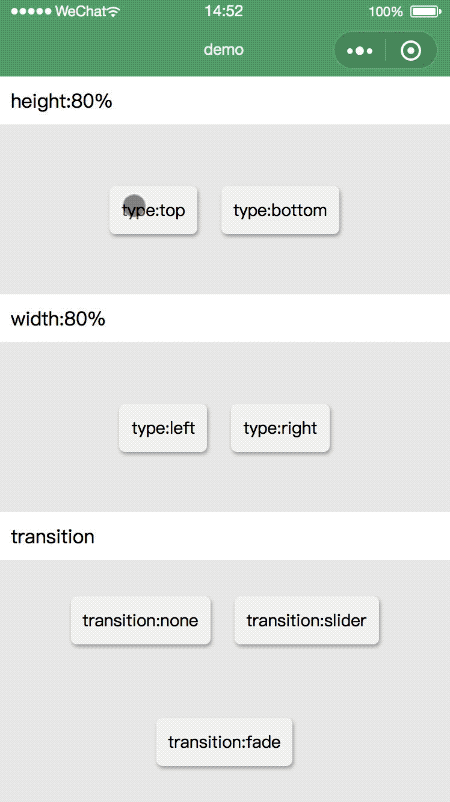
<text class="title">height:80%</text>
<view class="btn-group">
<view class="btn" @tap="top()">type:top</view>
<view class="btn" @tap="bottom()">type:bottom</view>
</view>
<text class="title">width:80%</text>
<view class="btn-group">
<view class="btn" @tap="left()">type:left</view>
<view class="btn" @tap="right()">type:right</view>
</view>
<text class="title">transition</text>
<view class="btn-group">
<view class="btn" @tap="none()">transition:none</view>
<view class="btn" @tap="slider()">transition:slider</view>
<view class="btn" @tap="fade()">transition:fade</view>
</view>
<luPopupWrapper ref="luPopupWrapper"
:type="type"
:transition="transition"
:backgroundColor="backgroundColor"
:active="active"
:height="height"
:width="width"
:popupId="popupId"
:maskShow="maskShow"
:maskClick="maskClick"
:closeCallback="closeCallback"
>
<view class="mycontent">
展示内容
</view>
</luPopupWrapper>
</view>
</template>
<script>
import luPopupWrapper from "@/components/lu-popup-wrapper/lu-popup-wrapper.vue";
export default {
components: {
luPopupWrapper
},
data() {
return {
type:"bottom",// left right top bottom center
transition:"slider",//none slider fade
backgroundColor:'#FFF',
active:false,
height:"100%",
width:"100%",
popupId:1,
maskShow:true,
maskClick:true,
};
},
methods:{
left: function() {
this.width ="80%";
this.height ="100%";
this.transition = "slider";
this.type = "left";
this.show();
},
right: function() {
this.width ="80%";
this.height ="100%";
this.transition = "slider";
this.type = "right";
this.show();
},
top: function(v) {
this.width ="100%";
this.height ="80%";
this.transition = "slider";
this.type = "top";
this.show();
},
bottom: function() {
this.width ="100%";
this.height ="80%";
this.transition = "slider";
this.type = "bottom";
this.show();
},
fade: function() {
this.width ="100%";
this.height ="80%";
this.transition = "fade";
this.type = "bottom";
this.show();
},
slider: function() {
this.width ="100%";
this.height ="80%";
this.transition = "slider";
this.type = "bottom";
this.show();
},
none: function() {
this.width ="100%";
this.height ="80%";
this.transition = "none";
this.type = "bottom";
this.show();
},
show: function() {
this.$refs.luPopupWrapper.show();
},
close: function() {
this.$refs.luPopupWrapper.close();
},
closeCallback:function() {
console.log("关闭后回调");
},
}
}
</script>
<style lang="scss">
.page-content {
position: relative;
width: 100%;
display: flex;
flex-flow: column nowrap;
justify-content: center;
align-items: center;
background-color: #fff;
font-size: 14px;
}
.title {
flex: none;
position: relative;
width: 100%;
height: 40px;
font-size: 16px;
padding-left: 20px;
display: flex;
flex-flow: row nowrap;
justify-content: flex-start;
align-items: center;
}
.btn-group {
flex: 1 1 auto;
position: relative;
width: 100%;
display: flex;
flex-flow: row wrap;
justify-content: center;
align-items: center;
background-color: #eee;
font-size: 14px;
.btn{
height: 40px;
display: flex;
flex-flow: row nowrap;
justify-content: center;
align-items: center;
background-color: #f9f9f9;
border-radius: 5px;
padding:0 10px;
margin: 10px;
overflow: hidden;
box-shadow: 1px 2px 3px rgba(100,100,100,0.5);
}
}
.mycontent{
display: flex;
flex-flow: row nowrap;
justify-content: center;
align-items: center;
height: 100%;
width: 100%;
overflow: scroll;
}
</style>
 下载 3972
 赞赏 1
赞赏 1

 下载 8956970
 赞赏 1300


 赞赏
赞赏
 京公网安备:11010802035340号