更新记录
1.1.2(2023-12-19)
1.1.1(2023-07-19)
1.1.0(2023-07-03)
- 支持dark/light主题、自定义插槽功能
- 新增关闭事件
查看更多
平台兼容性
uni-app
| app-vue |
app-nvue |
app-android |
app-ios |
| ? |
? |
? |
? |
| H5-Safari |
Android Browser |
微信浏览器(Android) |
QQ浏览器(Android) |
Chrome |
IE |
Edge |
Firefox |
PC-Safari |
| ? |
? |
? |
? |
? |
? |
? |
? |
? |
| 微信小程序 |
支付宝小程序 |
百度小程序 |
字节小程序 |
QQ小程序 |
钉钉小程序 |
快手小程序 |
飞书小程序 |
京东小程序 |
| ? |
? |
? |
? |
? |
? |
? |
? |
? |
uni-app x
| H5-Safari |
Android Browser |
微信浏览器(Android) |
QQ浏览器(Android) |
Chrome |
IE |
Edge |
Firefox |
PC-Safari |
| ? |
? |
? |
? |
? |
? |
? |
? |
? |
uniapp alert轻提示信息
组件名:uaAlert
代码块: <ua-alert>
uaAlert一款基于uni-app vue3开发的自定义提示信息组件。支持dark/light主题、文案居中、自定义图标及插槽内容。
注意事项
如果想自定义图标,需要自己引入iconfont图标
引入方式
本组件符合easycom规范,只需将本组件放在components目录,在页面template中即可直接使用。
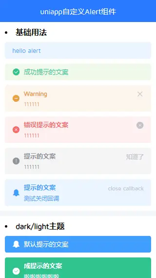
基本用法
示例
<ua-alert title="hello alert" />
<ua-alert title="成功提示的文案" type="success" showIcon />
<ua-alert title="Warning" description="描述信息" type="warning" showIcon closable />
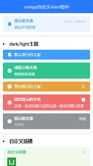
<ua-alert title="Info" description="描述信息" type="info" showIcon closable closeText="知道了" />
<ua-alert title="默认提示的文案" effect="dark" showIcon />
<ua-alert title="成提示的文案" description="啦啦啦啦啦啦" effect="light" type="success" showIcon />
<ua-alert title="警告提示的文案" effect="dark" type="warning" showIcon closable />
<ua-alert title="提示的文案" description="111111" effect="dark" type="info" showIcon closable closeText="关闭" />
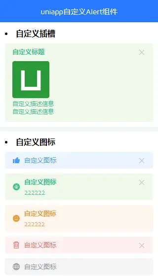
<ua-alert title="信息提示的文案" type="success" closable>
    <template #title style="color: #00bcd4;">自定义标题</template>
    <div style="padding: 5px 0;">
        <img src="/static/logo.png" alt="" style="width: 30px;" />
        <p>自定义描述信息</p>
        <p>自定义描述信息</p>
    </div>
</ua-alert>
<ua-alert title="自定义图标" showIcon icon="ve-icon-like1" closable />
<ua-alert title="自定义图标" description="111" type="success" showIcon icon="ve-icon-pay-circle" closable />
<ua-alert title="自定义图标" description="222" type="warning" showIcon icon="ve-icon-meho" />
<ua-alert title="自定义图标" type="danger" showIcon icon="ve-icon-delete" closable />
API
uaAlert Props
| 属性名 |
类型 |
默认值 |
说明 |
| modelValue |
Number/String |
- |
绑定值 |
| type |
String |
primary |
提示类型(primary / success / warning / danger / info) |
| effect |
String |
light |
主题(dark / light) |
| title |
String |
- |
标题 |
| description |
String |
- |
描述内容 |
| closable |
Boolean |
false |
是否可关闭 |
| center |
Boolean |
false |
文案是否居中显示 |
| showIcon |
Boolean |
false |
是否显示图标 |
| icon |
String |
- |
自定义图标 |
| closeText |
String |
- |
自定义关闭按钮 |
| closeIcon |
String |
- |
自定义关闭图标 |
事件
💝最后
开发不易,希望各位小伙伴们多多支持下哈~~ ☕️☕️


 收藏人数:
收藏人数:
 下载插件并导入HBuilderX
 赞赏(0)
赞赏(0)

 下载 1762
 赞赏 1
赞赏 1

 下载 8188960
 赞赏 1043


 赞赏
赞赏
 京公网安备:11010802035340号