更新记录
1.0.0(2022-09-10)
下载此版本
组件初始化
平台兼容性
| App |
快应用 |
微信小程序 |
支付宝小程序 |
百度小程序 |
字节小程序 |
QQ小程序 |
| app-vue |
× |
√ |
× |
× |
× |
× |
| 钉钉小程序 |
快手小程序 |
飞书小程序 |
京东小程序 |
鸿蒙元服务 |
| × |
× |
× |
× |
× |
| H5-Safari |
Android Browser |
微信浏览器(Android) |
QQ浏览器(Android) |
Chrome |
IE |
Edge |
Firefox |
PC-Safari |
| √ |
√ |
√ |
√ |
√ |
× |
√ |
√ |
√ |
o-btn
组件初衷是做多几个type不用额外定义样式就能满足需求 提高效率
基本用法
<template>
<view class="p-2">
<view class="py-2">
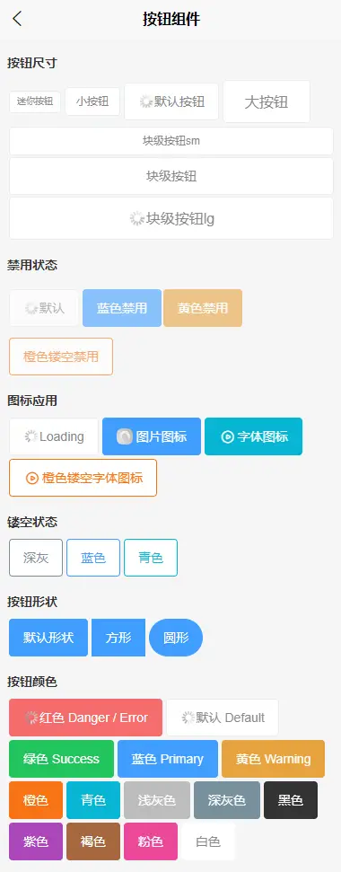
<view class="text-bold pb-2">按钮尺寸</view>
<o-btn size="xs">迷你按钮</o-btn>
<o-btn size="sm">小按钮</o-btn>
<o-btn loading>默认按钮</o-btn>
<o-btn size="lg">大按钮</o-btn>
<o-btn block size="sm">块级按钮sm</o-btn>
<o-btn block :loading="loading" :loading-text="Load">块级按钮</o-btn>
<o-btn block size="lg" icon="../../static/2.png" loading>块级按钮lg</o-btn>
</view>
<view class="py-2">
<view class="text-bold pb-2">禁用状态</view>
<o-btn disabled loading>默认</o-btn>
<o-btn type="blue" disabled>蓝色禁用</o-btn>
<o-btn class="my-2" type="yellow" disabled>黄色禁用</o-btn>
<o-btn type="orange" plain disabled>橙色镂空禁用</o-btn>
</view>
<view class="py-2">
<view class="text-bold pb-2">图标应用</view>
<o-btn loading>Loading</o-btn>
<o-btn type="blue" icon="../../static/2.png">图片图标</o-btn>
<o-btn type="cyan" icon="icon-bofang">字体图标</o-btn>
<o-btn type="orange" icon="icon-bofang" plain>橙色镂空字体图标</o-btn>
</view>
<view class="py-2">
<view class="text-bold pb-2">镂空状态</view>
<o-btn type="grey" plain>深灰</o-btn>
<o-btn type="blue" plain>蓝色</o-btn>
<o-btn type="cyan" plain>青色</o-btn>
</view>
<view class="py-2">
<view class="text-bold pb-2">按钮形状</view>
<o-btn type="blue">默认形状</o-btn>
<o-btn type="blue" square>方形</o-btn>
<o-btn type="blue" round>圆形</o-btn>
</view>
<view class="py-2">
<view class="text-bold pb-2">按钮颜色</view>
<o-btn type="red" loading>红色 Danger / Error</o-btn>
<o-btn loading>默认 Default</o-btn>
<o-btn type="green">绿色 Success</o-btn>
<o-btn type="blue">蓝色 Primary</o-btn>
<o-btn type="warning">黄色 Warning</o-btn>
<o-btn type="orange">橙色</o-btn>
<o-btn type="cyan">青色</o-btn>
<o-btn type="gray">浅灰色</o-btn>
<o-btn type="grey">深灰色</o-btn>
<o-btn type="black">黑色</o-btn>
<o-btn type="purple">紫色</o-btn>
<o-btn type="brown">褐色</o-btn>
<o-btn type="pink">粉色</o-btn>
<o-btn type="white" >白色</o-btn>
</view>
</view>
</template>
<script>
export default {
data() {
return {
Load:'加载中…',
loading:true,
};
},
mounted() {
setTimeout(()=> {
this.Load='',
this.loading=false
}, 3000);
}
}
</script>
<style lang="scss">
page{background-color:#f6f6f6;}
.p-2{padding:16rpx;}
.my-2{margin: 20rpx 0 !important;}
</style>
oBtn Props
| 属性名 |
类型 |
默认值 |
可选值 |
备注 |
| type |
string |
default |
red、green、blue、danger、orange、yellow、brown、pink、purple、black、grey、gray、white、default、primary、success、info、warning、error、cyan |
按钮颜色类型 |
| size |
string |
md |
xs、sm、md、lg |
尺寸 |
| text |
string |
- |
- |
按钮文字 |
| icon |
string |
|
图标名称或图片链接(图片在小程序请使用远程路径) |
自动识别 |
| block |
boolean |
false |
true |
开启块级元素 |
| plain |
boolean |
false |
true |
镂空按钮 |
| square |
boolean |
false |
true |
方形按钮 |
| round |
boolean |
false |
true |
圆形按钮 |
| disabled |
boolean |
false |
true |
禁用按钮 |
| loading |
boolean |
false |
true |
加载状态 |
| loading-text |
string |
- |
|
加载状态提示文字 |
oBtn Events
| 事件名称 |
说明 |
返回参数 |
| @click |
监听点击事件 |
- |


 收藏人数:
收藏人数:
 下载插件并导入HBuilderX
 赞赏(0)
赞赏(0)
 下载 1822
 赞赏 6
赞赏 6

 下载 9318135
 赞赏 1419


 赞赏
赞赏
 京公网安备:11010802035340号