

 收藏人数:
收藏人数:
 下载插件并导入HBuilderX
 下载插件ZIP
 赞赏(2)
赞赏(2)
更新记录
1.0.5(2020-11-25) 下载此版本
【修复】弹窗时背景闪一下的bug;
1.0.4(2020-04-10) 下载此版本
【优化】showModal进行Promise封装,并添加示例代码
1.0.3(2020-04-09) 下载此版本
【优化】弹窗关闭时再发送相关事件,避免事件处理函数中使用uni.navigateBack()时出现异常的bug;
查看更多平台兼容性
编写该插件初衷
插件市场有许多弹窗组件,但是不满足需求,原因如下:
- 不能全局遮挡原生导航栏和原生tabbar;
- 使用方式复杂,我需要像uni.showModal一样使用简单;
- 一些原生插件需要云打包生效,在开发阶段无法调试(如官方的原生插件DCloud-RichAlert);
为什么不直接使用uni.showModal(),原因如下:
- 在APP端ios和android样式不统一,android奇丑;
- 在APP端ios和android的确定和取消按钮位置相反,体验不好;
- 在APP端提示内容无法自定义对齐方式;
插件特点
- 使用nvue页面模拟弹窗,性能高效;
- 使用方式简单,不用云打包也可直接使用;
- 样式风格统一;
- 可二次开发;
插件注意
- 弹窗关闭时,父页面会触发onShow();
- 插件只支持APP端,小程序端和H5端,请自行切换为uni.showModal();
插件集成步骤
- 下载后将/pages/modal/modal页面拷贝到你项目的/pages目录下;
- 在pages.json中配置路由:
{ "path": "pages/modal/modal", "style": { "navigationStyle": "custom", "app-plus": { "animationType": "fade-in", "background": "transparent", "backgroundColor": "rgba(0,0,0,0)", "popGesture": "none" } } } -
在你自己的工具类中封装公共方法,如,
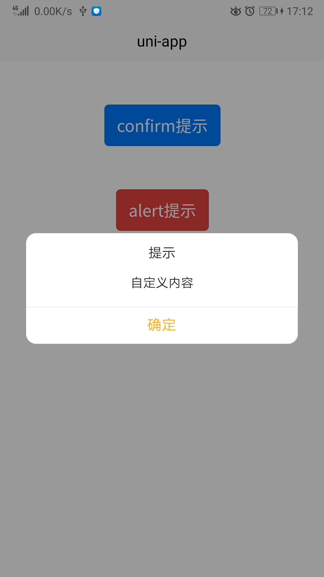
export const showModal = (options) => { let params = { title: "提示", content: "自定义内容", align: "center", // 对齐方式 left/center/right cancelText: "取消", // 取消按钮的文字 cancelColor: "#8F8F8F", // 取消按钮颜色 confirmText: "确定", // 确认按钮文字 confirmColor: "#FFAD15", // 确认按钮颜色 showCancel: true, // 是否显示取消按钮,默认为 true } Object.assign(params, options) let list = [] Object.keys(params).forEach(ele => { list.push(ele + "=" + params[ele]) }) let paramsStr = list.join('&') uni.navigateTo({ url: "/pages/modal/modal?" + paramsStr }) return new Promise((resolve, reject) => { uni.$once("AppModalCancel", () => { reject() }) uni.$once("AppModalConfirm", () => { resolve() }) }); } - 由于showModal返回了Promise,在你的业务中你可以这样使用:
async alert(options) { await this.showModal(options); uni.showToast({ title: "你点击了确定按钮", position: "bottom" }) }, async confirm(options) { try{ await this.showModal(options); uni.showToast({ title: "你点击了确定按钮", position: "bottom" }) }catch(e){ uni.showToast({ title: "你点击了取消按钮", position: "bottom" }) } }, - 进一步的showModal你都可以挂载到Vue实例上方便全局使用,超级方便:
// ------代码片段,请适量调整-----
// 在main.js中
import {showModal} from './common'
Vue.prototype.$showModal = showModal
// 全局使用
this.$showModal(options);
options参数说明
| 变量名 | 说明 |
|---|---|
| title | 标题 |
| content | 内容 |
| align | 内容对齐方式 |
| cancelText | 取消按钮的文字 |
| cancelColor | 取消按钮颜色 |
| confirmText | 确认按钮文字 |
| confirmColor | 确认按钮颜色 |
| showCancel | 是否显示取消按钮 |

 下载 3803
 赞赏 2
赞赏 2

 下载 8956970
 赞赏 1300


 赞赏
赞赏
 京公网安备:11010802035340号