更新记录
1.0.1(2023-08-27)
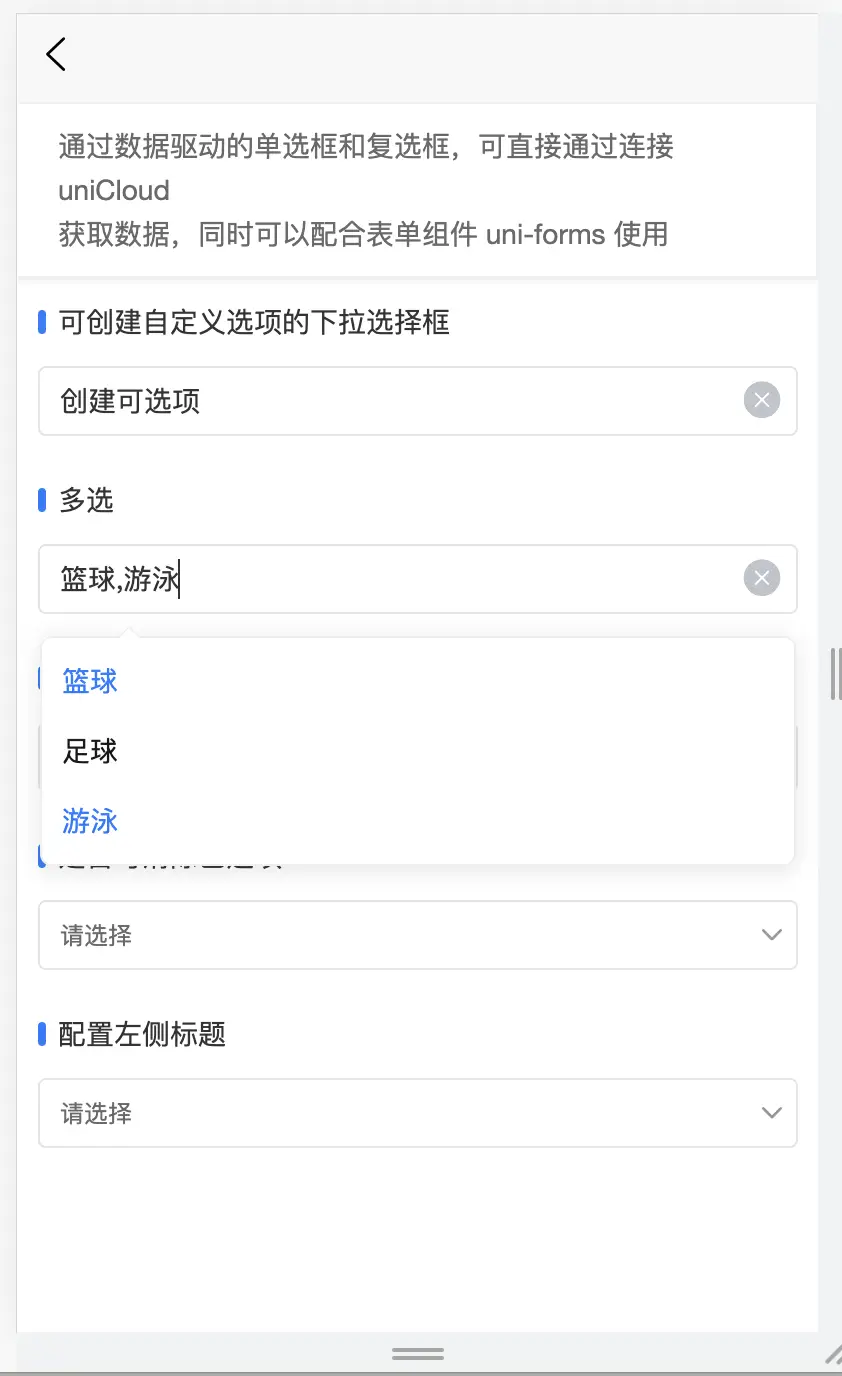
增加多选功能
1.0.0(2023-08-26)
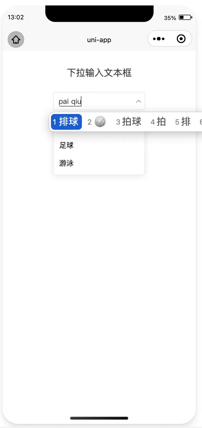
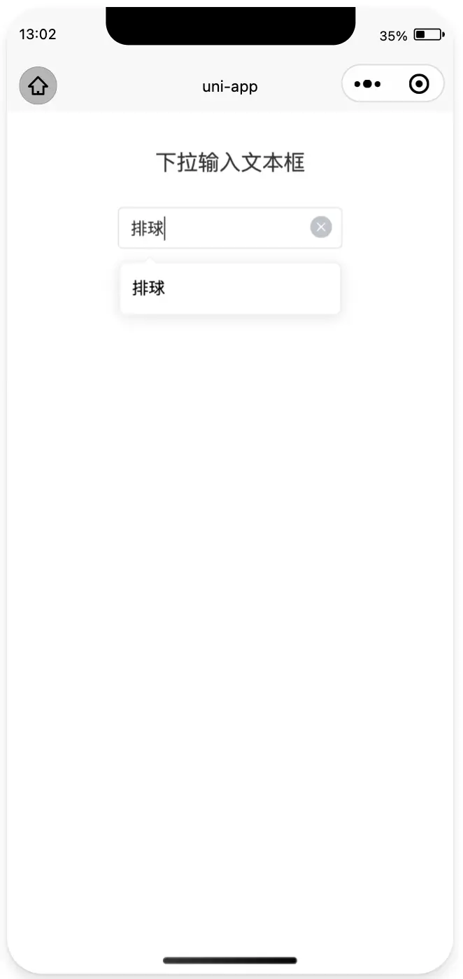
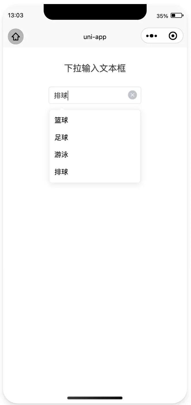
基于最新版uni-data-select改造的可输入自定义选项的下拉输入文本框选择器
平台兼容性
uni-app
| app-vue |
app-nvue |
app-android |
app-ios |
| ? |
? |
? |
? |
| H5-Safari |
Android Browser |
微信浏览器(Android) |
QQ浏览器(Android) |
Chrome |
IE |
Edge |
Firefox |
PC-Safari |
| ? |
? |
? |
? |
? |
? |
? |
? |
? |
| 微信小程序 |
支付宝小程序 |
百度小程序 |
字节小程序 |
QQ小程序 |
钉钉小程序 |
快手小程序 |
飞书小程序 |
京东小程序 |
| ? |
? |
? |
? |
? |
? |
? |
? |
? |
uni-app x
| H5-Safari |
Android Browser |
微信浏览器(Android) |
QQ浏览器(Android) |
Chrome |
IE |
Edge |
Firefox |
PC-Safari |
| ? |
? |
? |
? |
? |
? |
? |
? |
? |
基于最新版uni-data-select改造的可输入自定义选项的下拉输入文本框选择器
实现了与elementUI中同样的功能
使用案例:
<template>
<view>
<uni-card is-full>
<text class="uni-h6"
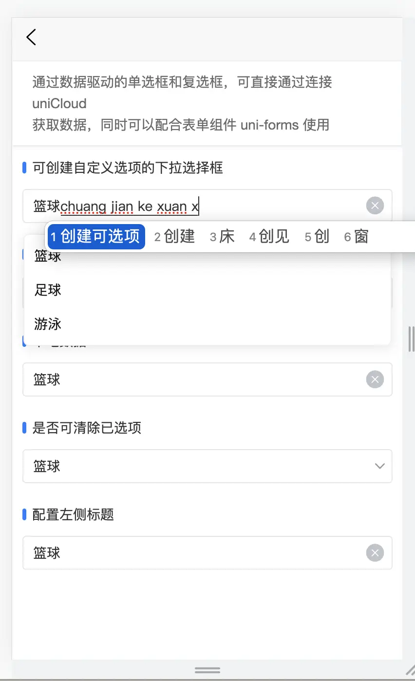
>通过数据驱动的单选框和复选框,可直接通过连接 uniCloud
获取数据,同时可以配合表单组件 uni-forms 使用</text
>
</uni-card>
<uni-section title="可创建自定义选项的下拉选择框" type="line">
<niceui-data-select-input
v-model="value"
:localdata="range"
@change="change"
class="uni-px-5 uni-pb-5"
></niceui-data-select-input>
</uni-section>
<uni-section title="多选" type="line">
<niceui-data-select-input
v-model="value"
:localdata="range"
@change="change"
multiple
class="uni-px-5 uni-pb-5"
></niceui-data-select-input>
</uni-section>
<uni-section title="本地数据" type="line">
<uni-data-select
v-model="value"
:localdata="range"
@change="change"
class="uni-px-5 uni-pb-5"
></uni-data-select>
</uni-section>
<uni-section title="是否可清除已选项" type="line">
<uni-data-select
v-model="value"
:localdata="range"
@change="change"
:clear="false"
class="uni-px-5 uni-pb-5"
></uni-data-select>
</uni-section>
<uni-section title="配置左侧标题" type="line">
<uni-data-select
v-model="value"
:localdata="range"
@change="change"
label="应用选择"
class="uni-px-5 uni-pb-5"
></uni-data-select>
</uni-section>
</view>
</template>
<script>
//import UniDataSelectInput from '@/uni_modules/niceui-data-select-input/components/niceui-data-select-input/niceui-data-select-input.vue'
export default {
components:{
//UniDataSelectInput
},
data() {
return {
value: 0,
range: [
{ value: 0, text: "篮球" },
{ value: 1, text: "足球" },
{ value: 2, text: "游泳" },
],
};
},
methods: {
change(e) {
console.log("e:", e);
},
},
};
</script>
<style lang="scss">
.text {
font-size: 12px;
color: #666;
margin-top: 5px;
}
.uni-px-5 {
padding-left: 10px;
padding-right: 10px;
}
.uni-pb-5 {
padding-bottom: 10px;
}
::v-deep uni-view, uni-imag, uni-text{
box-sizing: border-box;
flex-shrink: 1;
}
</style>
使用教程与uni-data-select一样,可点击下面查看文档进行使用。
DataSelect 下拉框选择器
组件名:uni-data-select
代码块: uDataSelect
当选项过多时,使用下拉菜单展示并选择内容
如使用过程中有任何问题,或者您对uni-ui有一些好的建议,欢迎加入 uni-ui 交流群:871950839


 收藏人数:
收藏人数:
 下载插件并导入HBuilderX
 赞赏(4)
赞赏(4)

 下载 1036
 赞赏 6
赞赏 6

 下载 8174223
 赞赏 1041


 赞赏
赞赏


 京公网安备:11010802035340号