

 收藏人数:
收藏人数:
 下载插件并导入HBuilderX
 下载示例项目ZIP
 赞赏(0)
赞赏(0)
更新记录
2.2(2020-09-11) 下载此版本
-
修复 支付宝小程序、H5 无波纹效果问题
2.1(2020-08-31) 下载此版本
-
修复波纹失效问题
2.0(2019-07-11) 下载此版本
完善官方button的基础功能,
如下: 新增plain、formType、openType、hoverStartTime、hoverStayTime、hoverClass、@getuserinfo等属性
并新增支持设置前缀图标:preIconType、preIconColor、preIconSize。(目前使用uniIcon, 有需求的自行修改
详见文档
查看更多平台兼容性
可直接拖进示例项目运行
作者想说
如果该插件有什么问题还请大家说出来哦,还有如果有什么建议的话也可以提下呐 ~ 如果觉得好用,可以回来给个五星好评么~~(❁´◡`❁)*✲゚* 蟹蟹~拜托啦~
组件简介
波纹按钮组件, 以官方button组件为基础,参考了vue-element-admin中waves.js的代码
使用说明
传给QS-WavesButton的属性
| 属性名 | 是否必填 | 值类型 | 默认值 | 说明 |
|---|---|---|---|---|
| txt | String | 按钮的文字,也可slot传入, txt属性优先 | ||
wavesColor |
Color | rgba(0, 0, 0, .15) | 波纹颜色 | |
| btnType | String | primary | button的类型, 同官方button的type | |
| size | String | default | button的size属性, 同官方button的size | |
| btnStyle | cssStyle | button的样式 | ||
| disabled | Boolean | false | button的disabled属性, 同官方button的disabled | |
| loading | Boolean | false | button的loading属性, 同官方button的loading | |
| @click | Function | 点击事件回调 | ||
以下为2.0新增 |
||||
| plain | Boolean | false | button是否镂空, 同官方button的plain | |
| formType | String | 用于 <form>组件,点击分别会触发 <form> 组件的 submit/reset 事件, 同官方button的form-type |
||
| openType | String | 开放能力, 同官方button的open-type | ||
| hoverStartTime | Number | false | 按住后多久出现点击态,单位毫秒, 同官方button的hover-start-time | |
| hoverStayTime | Number | false | 手指松开后点击态保留时间,单位毫秒, 同官方button的hover-stay-time | |
| hoverClass | String | false | 指定按钮按下去的样式类。当 hover-class="none" 时,没有点击态效果, 同官方button的hover-class | |
| @getuserinfo | Function | 用户点击该按钮时,会返回获取到的用户信息,从返回参数的detail中获取到的值同uni.getUserInfo, 同官方button的@getuserinfo | ||
| preIconType | String | button的前缀图标, (目前使用官方uniIcon,有需求的自行修改) | ||
| preIconColor | Color | #fff | button前缀图标颜色 | |
| preIconSize | String | 100% | button前缀图标的大小 |
<template>
    <view class="content">
        <div v-for="(item, index) in btnList" :key="index">
            <QSWavesButton
            btnStyle="margin: 10px;"
            :size="item.size"
            :btnType="item.type"
            :txt="item.txt"
            :wavesColor="item.wavesColor"
            :disabled="item.disabled"
            :loading="item.loading"
            :plain="item.plain"
            :formType="item.formType"
            :openType="item.openType"
            :hoverStartTime="item.hoverStartTime"
            :hoverStayTime="item.hoverStayTime"
            :hoverClass="item.hoverClass"
            :preIconType="item.preIconType"
            @getuserinfo="getuserinfo($event)"
            @click="clickFc(index)" >slot传入内容</QSWavesButton>
        </div>
    </view>
</template>
<script>
import QSWavesButton from '@/components/QS-WavesButton/QS-WavesButton.vue';
export default {
components: {
QSWavesButton
},
data() {
return {
btnList: [{
size: 'mini',
txt: 'size为mini'
},
{
type: 'warn',
txt: 'type为wran'
},
{
type: 'default'
},
{
type: 'warn',
plain: true,
txt:'镂空的波纹按钮'
},
{
wavesColor: 'rgba(255,255,255,.6)',
txt: '自定义颜色'
},
{
type: 'default',
txt: '自定义文字'
},
{
txt: '携带前缀图标',
preIconType: 'scan'
},
{
disabled: true,
txt: '禁用按钮'
},
{
loading: true,
disabled: true,
txt: '禁用加loading'
},
{
txt: 'form-type为submit',
formType: 'submit'
},
{
txt: 'form-type为reset',
formType: 'reset'
},
{
txt: 'open-type为feedback',
openType: 'feedback'
},
{
txt: 'open-type为share',
openType: 'share'
},
{
txt: 'open-type为getUserInfo',
openType: 'getUserInfo'
},
{
txt: '控制hover-start-time为100',
hoverStartTime: 100
},
{
txt: '控制hover-stay-time为200',
hoverStayTime: 200
},
{
txt: 'hover-class为none',
hoverClass: 'none'
}
]
}
},
methods: {
clickFc(text) {
uni.showToast({
title: '点击了:' + text
})
},
getuserinfo(e) {
console.log(JSON.stringify(e))
}
}
}
</script>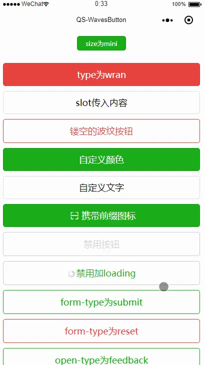
 下载 17753
 赞赏 28
赞赏 28

 下载 9693970
 赞赏 1529


 赞赏
赞赏
 京公网安备:11010802035340号