

 收藏人数:
收藏人数:
 下载插件并导入HBuilderX
 赞赏(0)
赞赏(0)
更新记录
0.0.8(2025-04-05) 下载此版本
- fix: 修复安卓离屏节点出现的问题
0.0.7(2025-02-10) 下载此版本
- fix: uniappx 安卓 text宽度受限bug
0.0.6(2024-12-15) 下载此版本
- feat: 兼容uniappx 微信小程序
平台兼容性
| Vue2 | Vue3 |
|---|---|
| √ | √ |
| App | 快应用 | 微信小程序 | 支付宝小程序 | 百度小程序 | 字节小程序 | QQ小程序 |
|---|---|---|---|---|---|---|
| HBuilderX 4.26 app-vue app-uvue | × | √ | × | × | × | × |
| 钉钉小程序 | 快手小程序 | 飞书小程序 | 京东小程序 | 鸿蒙元服务 |
|---|---|---|---|---|
| × | × | × | × | × |
| H5-Safari | Android Browser | 微信浏览器(Android) | QQ浏览器(Android) | Chrome | IE | Edge | Firefox | PC-Safari |
|---|---|---|---|---|---|---|---|---|
| √ | √ | √ | √ | √ | × | × | × | × |
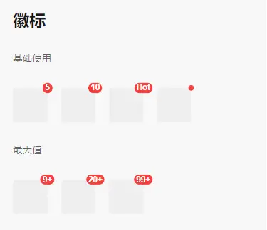
lime-badge 徽标
- 在右上角展示徽标数字或小红点。
文档
安装
插件市场导入即可,首次导入可能需要重新编译
代码演示
基础用法
设置 content 属性后,Badge 会在子元素的右上角显示对应的徽标,也可以通过 dot 来显示小红点。
<l-badge :content="5">
  <view class="child" />
</l-badge>
<l-badge :content="10">
  <view class="child" />
</l-badge>
<l-badge content="Hot">
  <view class="child" />
</l-badge>
<l-badge dot>
  <view class="child" />
</l-badge>

<style>
  .child {
    width: 40px;
    height: 40px;
    background: #f2f3f5;
    border-radius: 4px;
  }
</style>
最大值
设置 max 属性后,当 content 的数值超过最大值时,会自动显示为 {max}+。
<l-badge :content="20" max="9">
  <view class="child" />
</l-badge>
<l-badge :content="50" max="20">
  <view class="child" />
</l-badge>
<l-badge :content="200" max="99">
  <view class="child" />
</l-badge>
自定义颜色
通过 color 属性来设置徽标的颜色。
<l-badge :content="5" color="#1989fa">
  <view class="child" />
</l-badge>
<l-badge :content="10" color="#1989fa">
  <view class="child" />
</l-badge>
<l-badge dot color="#1989fa">
  <view class="child" />
</l-badge>
自定义徽标内容
通过 content 插槽可以自定义徽标的内容,比如插入一个图标。
<l-badge>
  <view class="child" />
  <template #content>
    你好
  </template>
</l-badge>
.badge-icon {
  display: block;
  font-size: 10px;
  line-height: 16px;
}
自定义徽标位置
通过 position 属性来设置徽标的位置。
<l-badge :content="10" position="top-left">
  <view class="child" />
</l-badge>
<l-badge :content="10" position="bottom-left">
  <view class="child" />
</l-badge>
<l-badge :content="10" position="bottom-right">
  <view class="child" />
</l-badge>
独立展示
当 Badge 没有子元素时,会作为一个独立的元素进行展示。
<l-badge :content="20" />

<l-badge :content="200" max="99" />
查看示例
- 导入后直接使用这个标签查看演示效果
<!-- // 代码位于 uni_modules/lime-badge/compoents/lime-badge -->
<lime-badge />
插件标签
- 默认 l-badge 为 component
- 默认 lime-badge 为 demo
关于vue2的使用方式
- 插件使用了
composition-api, 如果你希望在vue2中使用请按官方的教程vue-composition-api配置 - 关键代码是: 在main.js中 在vue2部分加上这一段即可
// vue2
import Vue from 'vue'
import VueCompositionAPI from '@vue/composition-api'
Vue.use(VueCompositionAPI)
API
Props
| 参数 | 说明 | 类型 | 默认值 |
|---|---|---|---|
| content | 徽标内容 | number | string | - |
| color | 徽标背景颜色 | string | #ee0a24 |
| dot | 是否展示为小红点 | boolean | false |
| max | 最大值,超过最大值会显示 {max}+,仅当 content 为数字时有效 |
number | string | - |
| offset | 设置徽标的偏移量,数组的两项分别对应水平向右和垂直向下方向的偏移量,默认单位为 px |
[number | string, number | string] | - |
| show-zero | 当 content 为数字 0 或字符串 '0' 时,是否展示徽标 | boolean | true |
| position | 徽标位置,可选值为 top-left bottom-left bottom-right |
string | top-right |
Slots
| 名称 | 说明 |
|---|---|
| default | 徽标包裹的子元素 |
| content | 自定义徽标内容 |
主题定制
样式变量
组件提供了下列 CSS 变量,可用于自定义样式。
| 名称 | 默认值 | 描述 |
|---|---|---|
| --l-badge-size | 16px | - |
| --l-badge-color | white | - |
| --l-badge-padding | 0 3px | - |
| --l-badge-font-size | 12px | - |
| --l-badge-font-weight | bold) | - |
| --l-badge-border-width | 1px | - |
| --l-badge-background | #F53F3F | - |
| --l-badge-dot-color | #F53F3F | - |
| --l-badge-dot-size | 8px | - |
| --l-badge-font | -apple-system-font, Helvetica Neue, Arial, sans-serif | - |
| --l-badge-border-radius | 999px | - |
打赏
如果你觉得本插件,解决了你的问题,赠人玫瑰,手留余香。


 下载 52090
 赞赏 345

 下载 9692544
 赞赏 1528


 赞赏
赞赏
 京公网安备:11010802035340号